KARAK MURUK
Karak Muruk is a brand name inspired by the bold, crunchy sound of biting into something crisp with “Muruk” being a Tamil expression for that satisfying crunch. The logo was designed to visually capture that sound and sensation, turning a local expression into a strong, memorable brand identity.
This project blends fun typography with expressive visual elements to reflect the snack’s texture, sound, and local cultural flavor in a playful yet impactful way.
logo design
finalised design
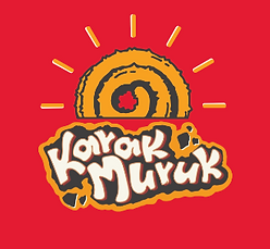
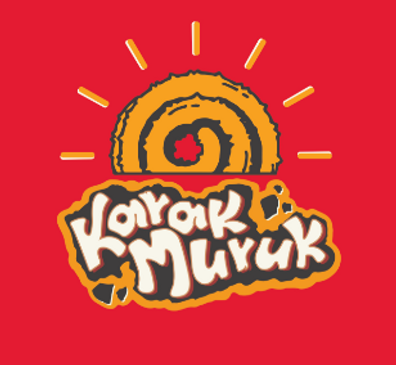
The final logo for Karak Muruk features a bold, hand-drawn style with a crunchy snack spiral called MURUKU and expressive lettering. It captures the sound, energy, and fun behind the brand name making it eye-catching and culturally rooted. Perfect for snack packaging and youth-focused branding.
Color Scheme
The color palette was chosen to reflect the bold, rustic, and flavorful nature of traditional South Indian snacks. I explored multiple combinations, from warm reds and spicy yellows to earthy browns and playful contrasts.
Each variation brings a unique flavor to the brand:
-
Bright Yellow & Red evoke energy, crunch, and snack-time excitement.
-
Brown & Beige tones reflect the earthy, crispy texture of fried murukku.
-
Maroon and Deep Orange give a festive, cultural richness.
-
Playful Contrasts like light backgrounds with strong outlines help the logo adapt across digital and packaging contexts.


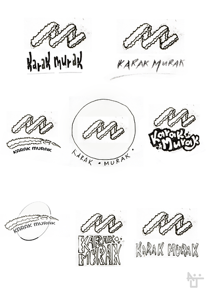
Initial Sketch
I explored a wide range of visual ideas to capture the bold, crunchy sound of 'Karak Muruk.' The sketches included spiral snacks, broken pieces, dynamic lettering, and Tamil-inspired forms. These rough concepts helped explore how the sound, texture, and energy of the brand could be visualized in a fun and expressive way."


Concept & Inspiration
The name “Karak Muruk” comes from the Tamil onomatopoeic expression that mimics the loud, satisfying crunch of biting into a crispy snack. The goal was to translate that bold sound and texture into a visual identity.


package design
A Peek into the Crunch
The Karak Muruk packaging design captures the snack’s essence — loud, crispy, and full of flavor — through bold visuals and expressive typography. Drawing inspiration from the Tamil word “Karak,” which mimics the crunchy sound, the design plays with texture, motion lines, and crumb elements to evoke a fun and energetic snacking experience.
The color scheme uses warm, appetite-stimulating tones like reds, yellows, and browns to evoke flavor and freshness. The playful, hand-drawn logo sits prominently at the center, surrounded by illustrative bursts that enhance visual dynamism. Overall, the packaging stands out on shelves while staying true to the brand’s authentic, local roots.

One key feature is the transparent window thoughtfully integrated into the design, allowing customers to see the actual murukku inside. This adds an element of honesty and trust, while also showcasing the product’s handmade appeal and crispy texture.


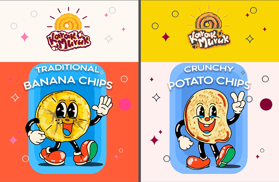
Each pack features a cheerful character mascot that brings the snack to life. With bold colors and playful designs, the packaging adds a fun twist to every crunchy bite.
finalised design by the clint
The Karak Muruk packaging combines bold colors, hand-drawn style, and a playful logo to reflect the snack’s crunchy appeal. A transparent window lets customers see the product, highlighting freshness and trust. Clean layout, vibrant palettes, and clear labeling make it easy to spot and enjoy — just like the snacks inside.
