HIMALAYA
2019
For this study-based rebranding project, I reimagined the Himalaya logo with a fresh and modern approach while staying true to the brand’s core values of natural care, purity, and wellness.
rebranding - study purpose
logo design
finalised design
-
Symbol (H): The original "H" is stylized to include a leaf integrated within the letterform. This leaf symbolizes nature, herbal ingredients, and organic care, which are the foundation of Himalaya's brand identity.
-
Typography: I chose a clean, rounded sans-serif typeface for the "imalaya" text, creating a friendly and trustworthy appearance. The letterforms are bold yet soft, reflecting the brand's gentle yet effective skincare solutions.
-
Color Palette:
-
Green: A deeper, refreshing green is used to represent herbal purity, health, and nature.
-
Pink Accent (HERBAL): A contrast line and the word "HERBAL" in pink adds a modern, youthful energy and a sense of care and skin wellness.
-
-
Structure: The layout emphasizes clarity and balance. “Himalaya” sits confidently above a clean line, below which “HERBAL” is spaced evenly to enhance visual stability and brand emphasis.
Himalaya – Complete Brand Redesign Study
Full Brand Makeover
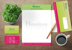
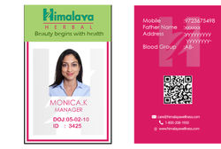
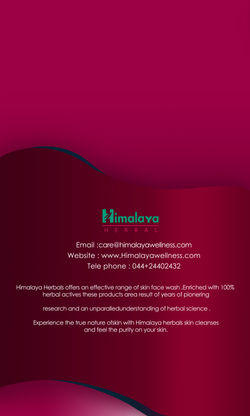
A complete rebranding and promotional design package for Himalaya, featuring logo redesign, product packaging, and a full range of marketing and corporate collaterals.


Full Brand Makeover
standee
poster


 standee mockup |  banner display |  |
|---|---|---|
 danglers display |
Full Brand Makeover


design for Danglers
bus stop banner design

Newspaper Ad


Flyer
Magazine

danglers display |  bus-stop mockup |  magazine mockup |
|---|---|---|
 newspaper mockup |  flyer mockup |
Mockups
 |  |  |
|---|---|---|
 |  |  |
 |  |  |
|---|---|---|
 |  |