manam
Introducing the 'Manam' logo design, inspired by the meaning 'Aroma' in Tamil. This design embodies the rich heritage and aromatic qualities of our cardamom product.
Additionally, the package design complements this identity, emphasizing the product's premium quality and authentic flavor.

logo design
finalised design

Introducing the 'Manam' logo design, inspired by the meaning 'Aroma' in Tamil.
Initial Sketch:
This is the initial sketch of the 'Manam' logo, where the concept and basic elements were first explored.


COLOR SCHEMES
I also presented different color schemes for the client to choose from, ensuring they matched the brand’s identity.

Font Selection
I manually created various font styles for the client to choose from, ensuring each option aligned with the brand's identity.


Reimagining the Design
After receiving feedback from the client, I revised the design to better align with their vision and brand identity. This stage focused on refining elements, improving clarity, and ensuring the final outcome met their expectations."


manual font design
I manually created different font styles for the client to choose from, ensuring each one aligned with the brand's identity.


Vector Design
After the client selected a preferred font and design, the chosen sketch was refined and converted into a vector design.


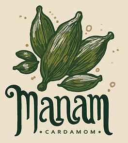
This is the final vector logo selected by the client, representing the essence of our cardamom product.
package design
Initial Concept & Design Development
The package design for Manam began with exploring the essence of the brand — premium cardamom rooted in rich tradition. I sketched out initial layout ideas, focusing on natural tones, bold typography, and traditional motifs to capture the aromatic and authentic quality of the product.
Using the approved logo, I experimented with different layout structures, graphic elements, and mockups. I also created multiple font styles and color schemes for the client to choose from, ensuring the visuals aligned with the brand’s premium feel.


Revised Based on Client Input
After reviewing the initial design, the client shared reference pouches to indicate their plan to use gold shine print technology. Based on this feedback, I reworked the layout by incorporating gold-printed elements in key areas. I retained the core pattern from the earlier version and enhanced it with metallic highlights to create a luxurious and premium look, aligning with the new production direction.


Final Output
The final package design combines the brand’s essence with an elevated finish. The gold accents bring a rich and refined feel to the packaging, making the Manam cardamom stand out with both visual impact and cultural authenticity.

